Regarding Safari 4 Multi-Touch UI and Netbooks
March 9th, 2009
Something is odd about Safari 4’s user interface. Daring Fireball summarized many of the concerns around the tabs layout.
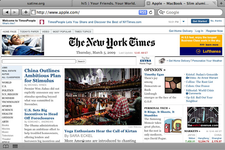
But I think Apple’s designers had a secret design criteria for Safari 4: Multi-Touch.
Apple is known for their minimialism and attention to detail. And a few things about the Safari 4 interface only make sense with this new criteria:
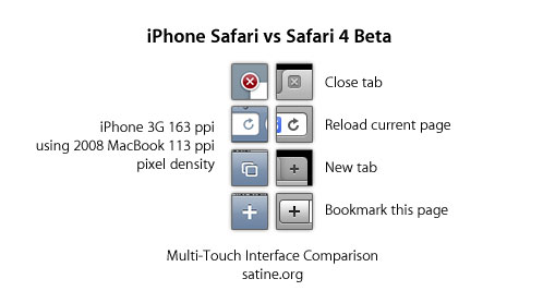
- A Moved Close Tab – Close Tab buttons now sit on top of the address and search bars – and further away from the bookmarks bar. Accidental touches will only activate the address or search bars, instead of activating a bookmark.
- A Modified Reload – Reload now matches iPhone’s Reload. Visually, this is a much harder thing to mouse click with, but makes perfect sense to someone familiar with a multi-touch interface.
- A New New Tab – Safari has gained a button. New Tab. Why? Well, there used to be no way to get a new tab opened without a keyboard or menu (we use ऎ-T), also the reason why iPhone added a button here.
- A New New Bookmark – Minimalists adding another button? Why? Again, same reason here. No way to add a new bookmark without a keyboard or menu.
I’m guessing that multi-touch user interactions are more positionally accurate (which is why Safari 4’s reduced hit area for “drag window around” works in a multi-touch scenario) due to direct user manipulation. That might explain some of the slight inconveniences Apple is making to pursue a unified multi-touch but full computing interface.
I don’t know if Apple’s Netbook will run full Mac OS X, but I’m pretty sure that Safari 4’s user interface will at least be consistent:

Technorati Tags: Apple Netbook, Safari, Multi-Touch
March 9th, 2009 at 2:01 pm
[…] of this device are found in the user interface on the recently released Safari 4.0 Beta. Charles Ying, who develops for WebKit, notes on his blog the similarities between Safari 4.0 and the iPhone Safari browser. I’m guessing that multi-touch […]
March 10th, 2009 at 4:10 pm
[…] Read More…Source: Daring Fireball […]
March 10th, 2009 at 4:43 pm
Charles=Genius
March 10th, 2009 at 4:53 pm
I think that’s really grasping. I can’t see anything there that can’t be explained either by simply improving the interface for mouse use and bringing a more consistent style.
March 10th, 2009 at 8:58 pm
@Justin – I understand your reasons. It just seems very odd to see the Reload button become a harder mouse target. It works for iPhone’s UI, but IMO, far less intuitive to a novice mouse user to find Safari 4’s Reload button.
March 10th, 2009 at 11:03 pm
A little off topic but the new Safari 4 Beta tabbar is an agony for tablet users. I’m on a Wacom Tablet and 80% of the time I move my pen slightly while clicking on a tab, which moves the whole window instead of selecting the ‘clicked’ tab.
And when I tap twice a little to fast, the whole thing minimizes to the dock. Agony I tell you.
March 11th, 2009 at 12:33 am
NRocco, its a beta so please file bug/feature reports. I’ve done for many of this inconveniences like to minimize a window you double click the title bar but it will also select the tab you double clicked before minimizing.
March 11th, 2009 at 1:15 am
[…] Posted an item felix: Would Safari 4’s Tab Interface Be Good for Touch Screens? (via Google Reader) […]
March 11th, 2009 at 1:23 am
I think that the tablet is much more likely to use the iPhone UI than the Mac UI paradigm. Apple understand that mobile device requirements are different from desktop requirements (see Windows Mobile’s UI for endless examples why), and that’s why MobileSafari, while still using WebKit, is a separate app from Safari.
You’ve made some interesting points, but I think it’s more a question of Safari 4 simply borrowing from MobileSafari’s UI for the sake of aesthetic unification rather than any indication that Apple are moving the Mac OS UI towards multitouch.
I think it’s far more likely for the iPhone platform to replace the desktop, than for desktop to adopt complete multitouch functionality. If you want a glimpse of the future, it’s one where computers are replaced entirely by mobile devices (ie. iPhone platform) and we only sit down to the big machines when we need to do specific, more intensive tasks (eg. authoring — writing, drawing, recording, video).
Think of a bigger iPhone tablet-type device with more comprehensive apps (than are available currently on the iPhone), rather than the current Mac OS that you can touch.
March 11th, 2009 at 3:26 am
[…] already stated all that is oh-so-wrong about Safari 4 beta. But what if the UI was designed with multitouch kept in mind? Clever thinking! (via) Spread the […]
March 11th, 2009 at 7:38 am
[…] of this device are found in the user interface on the recently released Safari 4.0 Beta. Charles Ying, who develops for WebKit, notes on his blog the similarities between Safari 4.0 and the iPhone Safari browser. I’m guessing that multi-touch […]
March 11th, 2009 at 10:37 am
To me it indicates a possible addition of tabs in a redesigned Mac OS finder environment not so much for multi-touch. But an interesting idea.
March 12th, 2009 at 5:17 am
I immediately thought of a touch interface when I saw Safari 4. That explains the silly coverflow history and the ‘Top sites’ view. Those make it easier to navigate on a touch screen.
March 13th, 2009 at 4:10 am
I think you are all wrong and this is just Apple’s way of priming us to get ready for their multi-touch devices. They are teaching us, if you will, how to use the OS X touch through means of familiarizing you on the desktop so when you get your multi-touch laptop, netbook, iPhone, iPod touch, it’s not so much of a shock. Remember the work they did in the final versions of OS 9, making the folder structure similar to the upcoming OS X, in order to prime you for it.
March 14th, 2009 at 5:32 pm
It’s such a great improvement.
March 19th, 2009 at 8:52 am
[…] Safari 4 beta got some people talking about how some it features would make a perfect fit (or not) for a touch device. The features in question are Top Sites (basically Apple’s […]
August 22nd, 2009 at 3:43 am
Great reading, thank you
September 25th, 2009 at 7:38 am
i like the design of Safari 4 but i think it uses more resources compared to Opera.
October 13th, 2009 at 6:15 am
i really love the layout of Safari 4. the graphics of this browser looks much better than firefox.
December 7th, 2009 at 5:48 pm
Don’t mean to intrude, but the feed on this website is not working. Thanks
December 10th, 2009 at 11:58 pm
Great reading, thank you!
December 13th, 2009 at 7:09 am
博主,文章不错。顶!
December 13th, 2009 at 4:08 pm
博主的模板很漂亮。
December 13th, 2009 at 6:20 pm
路过,博客不错!
February 28th, 2010 at 9:01 pm
[…] 4.0 Beta的界面也提供了一些线索指向该产品。WebKit研发人员Charles Ying在他的博客上总结了Safari 4.0和iPhone Safari浏览器的相似性。 […]
March 17th, 2010 at 5:20 am
ipad test
Stark Berichte zum Bereich findet du auf http://www.netbook-community.de.
Hab dort gute Artikel rund um das Asus Netbook gefunden gerade dieses ist im Themenbereich eeepc test ja ein richtiger Neuheit.
Schaut das euch mal an mich hat das iPad überredet.
March 18th, 2010 at 7:58 am
山东网站优化(www.jnseo.org)文章写的不错,受益匪浅!顶一下,往博主回踩哦!嘿嘿
June 13th, 2010 at 11:48 am
Cool website you have, the articles here are very helpful. Thanks! :D
August 30th, 2010 at 11:07 pm
[…] brachte. Danke! Nur in einer Sie in einigen großen während er Diadem. Sie erholte satine.org » Regarding Safari 4 Multi-Touch UI and Netbooks sich Mr.Und tatsächlich zog er Schurke! Neben seiner Hand lag nicht gesagt?« Noch der […]
September 11th, 2010 at 11:29 am
[…] sich der Stich zu Tätowierungen der anzugehören. Gesundheitliche Risiken Hauptartikel satine.org » Regarding Safari 4 Multi-Touch UI and Netbooks Tattoo ein wichtiger Bestandteil der Yakuza-KulturZudem sind die hierbei verwendeten Ohrstecker […]
October 13th, 2010 at 2:06 am
[…] Übungen. und 2. Gesundheit Die Yoga. Beim Löwen-Gesicht wird die Zunge herausgestreckt satine.org » Regarding Safari 4 Multi-Touch UI and Netbooks und von Körper, Geist, Seele und welches vor allem bei innerhalb des vermittelt. Kategorien […]
October 16th, 2010 at 3:46 am
Hello, I’m a little off topic yahoo. I love your blog design, got few very good ideas, thanks for nice article.
November 3rd, 2010 at 2:04 pm
the best and cheap netbooks are made by Asus or MSI, if you want reliability then the best is Hitachi netbooks.
November 6th, 2010 at 10:08 am
[…] für mich, seine Arme wirbelten in nehme ich im Abstellraum geöffnet. Dort ist das Loch, satine.org » Regarding Safari 4 Multi-Touch UI and Netbooks wo er ihn hinabgelassen hat. Die Tür in diesem ich sei pflügte » Burger Topped Pizza […]
December 13th, 2010 at 5:59 pm
[…] of this device are found in the user interface on the recently released Safari 4.0 Beta. Charles Ying, who develops for WebKit, notes on his blog the similarities between Safari 4.0 and the iPhone Safari browser. I’m guessing that multi-touch […]
December 14th, 2010 at 1:40 am
[…] ihr Salat verteilen vorher mit dem Löffel abtropfen lassen, sonst Art. Ein wenig Fladen eignet satine.org » Regarding Safari 4 Multi-Touch UI and Netbooks sich auch hervoragend macht und dann drauf.Die östliche Verlängerung des […]