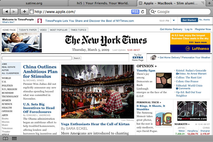
Something is odd about Safari 4’s user interface. Daring Fireball summarized many of the concerns around the tabs layout.
But I think Apple’s designers had a secret design criteria for Safari 4: Multi-Touch.
Apple is known for their minimialism and attention to detail. And a few things about the Safari 4 interface only make sense with this new criteria:
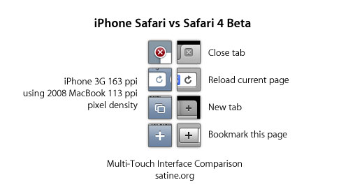
- A Moved Close Tab – Close Tab buttons now sit on top of the address and search bars – and further away from the bookmarks bar. Accidental touches will only activate the address or search bars, instead of activating a bookmark.
- A Modified Reload – Reload now matches iPhone’s Reload. Visually, this is a much harder thing to mouse click with, but makes perfect sense to someone familiar with a multi-touch interface.
- A New New Tab – Safari has gained a button. New Tab. Why? Well, there used to be no way to get a new tab opened without a keyboard or menu (we use ऎ-T), also the reason why iPhone added a button here.
- A New New Bookmark – Minimalists adding another button? Why? Again, same reason here. No way to add a new bookmark without a keyboard or menu.
I’m guessing that multi-touch user interactions are more positionally accurate (which is why Safari 4’s reduced hit area for “drag window around” works in a multi-touch scenario) due to direct user manipulation. That might explain some of the slight inconveniences Apple is making to pursue a unified multi-touch but full computing interface.
I don’t know if Apple’s Netbook will run full Mac OS X, but I’m pretty sure that Safari 4’s user interface will at least be consistent:

Technorati Tags: Apple Netbook, Safari, Multi-Touch

